Responsive Redesign of my Wordpress Blog
Published October 17, 2012
This article was published a really long time ago.
Its value then was likely questionable. Its value now is certainly pure nostalgia.
Over the past few weeks I've been spending some of my spare time slowly redesigning my blog. The main reason for the redesign was to create a responsive design. I was also a bit bored of my old one which I had even switched out for the default Wordpress theme in recent times.
Some notes on Responsive Web Design
The PSD Design
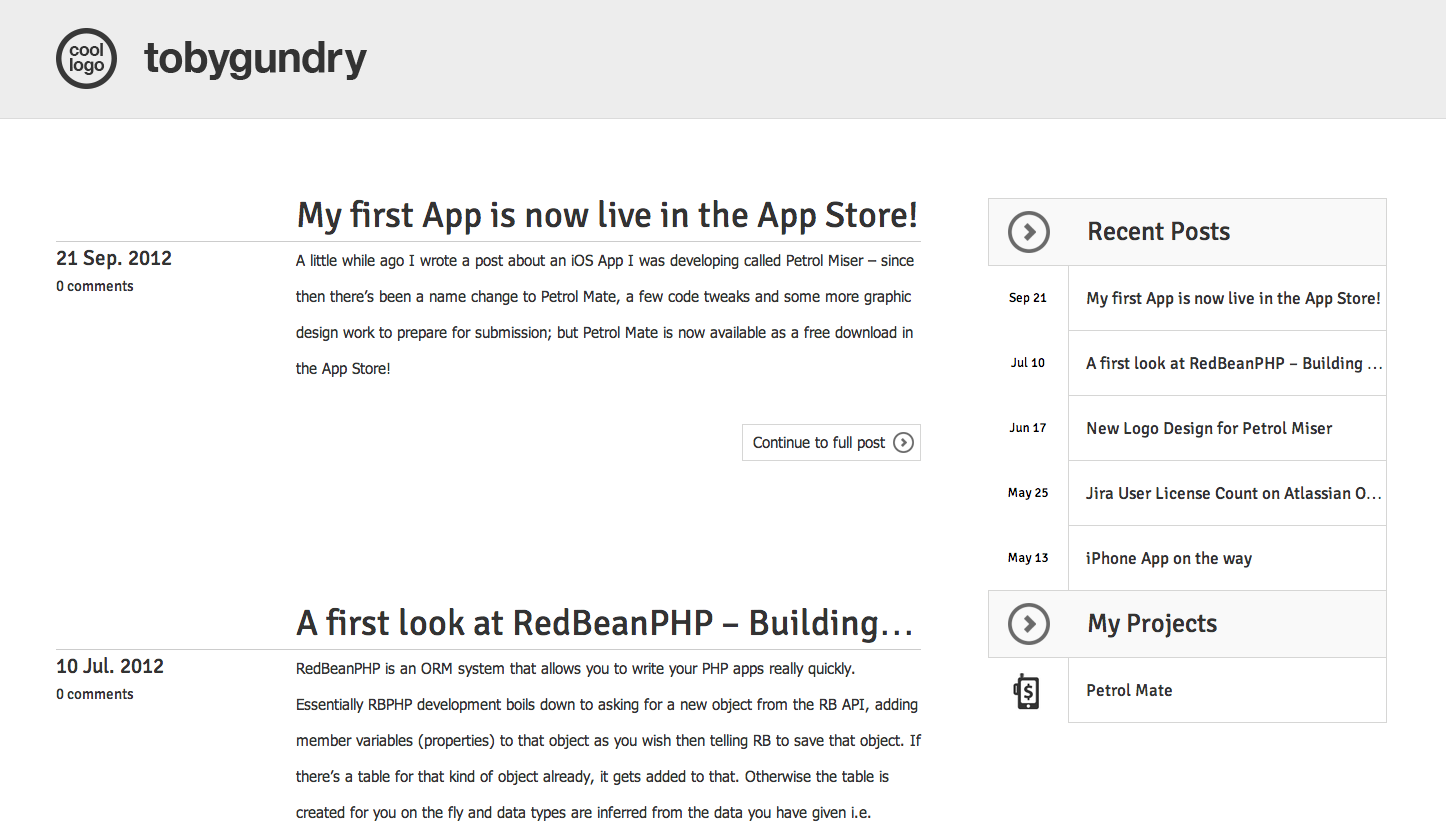
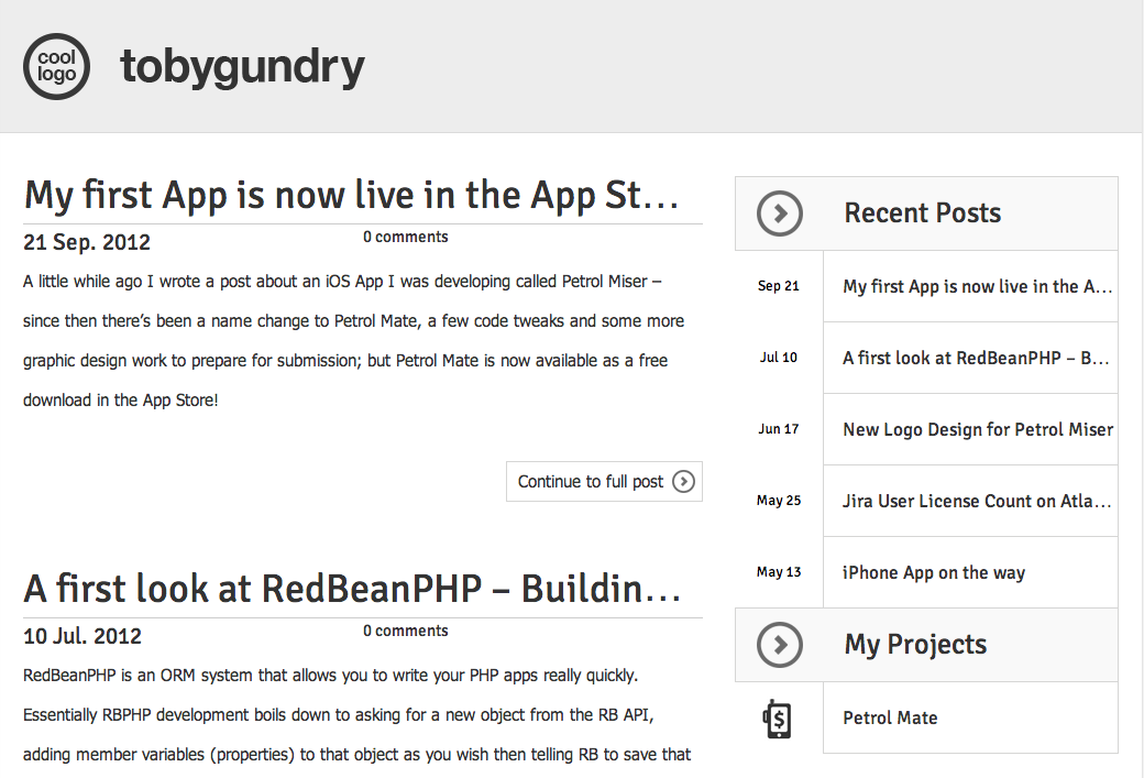
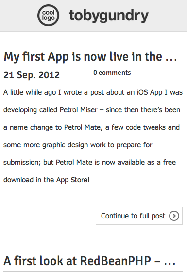
Ordinarily when I design a site in Photoshop it would be for a fixed-width site and what I create in Photoshop would be exactly what I expected to see on the page after coding. Of course things are a little different with Responsive Web Design, fixed-width is an incompatible concept; but the process of designing the PSD was pretty much the same for me in this instance (maybe that will change in time.) I started with a standard desktop design, then created a new project for the mobile design and copied in elements from the original and arranged it all into a logical design. The mobile version was simply used as a guide, there was no need for "slicing" from it and my tablet sized viewports breakpoint was just a logical rearranging between these 2 designs. I'd be interested to know how agencies with rigidly defined roles between designer and front end developer are handling this.
Breakpoints
From what I read on the web before starting my responsive redesign, there were more or less 2 schools of thoughts on breakpoints. People who would design for a specific sets of viewport dimensions, and people who start at either very small or large dimensions and work in the other direction until the design breaks (which actually, really only happens going from large to small because small single column layouts won't usually break as such as they will just look silly.)
I sit firmly in the latter camp, and I worked from a design that worked comfortably on a massive 2560 and worked down to breakpoints of < 1366, < 1140, and < 700 which were picked because this is roughly where the design started to work better with some adjustments.
ProtoFluid & Testing
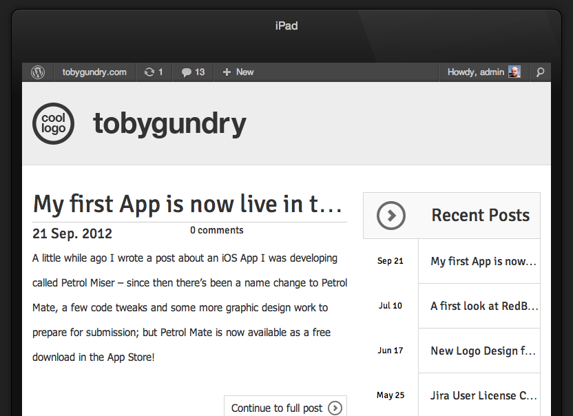
ProtoFluid is a small JavaScript that allows you to quickly view what your responsive design looks at in some popular devices at various orientations. To use it you'll need jQuery and to reference the JavaScript file from your head section. To use it just add #protoFluid to the page you want to preview and you'll see something like this:
ProtoFluid should only be used to get a rough idea of what your design looks at in various viewports. Don't rely on it for giving you an exact representation of what your design looks like on the device dimensions provided, it will look different, especially in regard to font sizes and line heights etc.
CSS Transitions
Why not. If you don't know what CSS Transitions are, slowly start decreasing the width of your browser window to see them in action (providing you know you're on a browser that probably supports them.) CSS Transitions make the switching between breakpoints appear smooth and fluid like rather than everything just "snapping" to their new positions. Browsers that don't support Transitions will just ignore the property which to me seems acceptable, and sprinkling a few transition properties around your stylesheet only takes a few minutes.


